
AGU– CONVERSATIONAL USER INTERFACE FOR IKEA
Agu is designed to live inside the existing IKEA website and mobile app, functioning as personal customer support for the post-shopping experience. My team and I considered how to make Agu an extention of the existing brand and reflect the friendliness many people associate IKEA with. In this project, we designed 10 different states as well as a video showcasing how Agu can be used in the IKEA shopping journey.

OVERVIEW
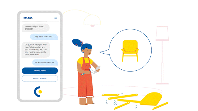
Meet Agu – A conversational user interface for IKEA that supports customers in the post-shopping stage, an integral part of the IKEA experience.
TEAM
ROLE
TIMELINE
5 weeks, Spring
Research
Visual Designer
Chelsea Liu
Hayoon Choi
Neely Lee
TOOLS
Figma
Adobe After Effects
UX DESIGN | USER RESEARCH | BRAND IDENTITY | GRAPHIC DESIGN | MOTION GRAPHICS


Problem space + SOLUTION
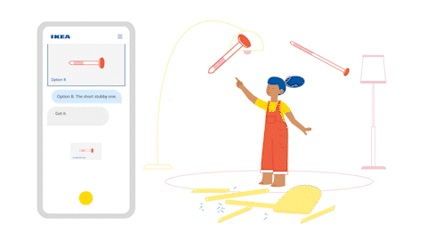
Based on the pain points, our team is suggesting a conversational customer support system that would provide more personalized and accessible support for the post-shopping experience.


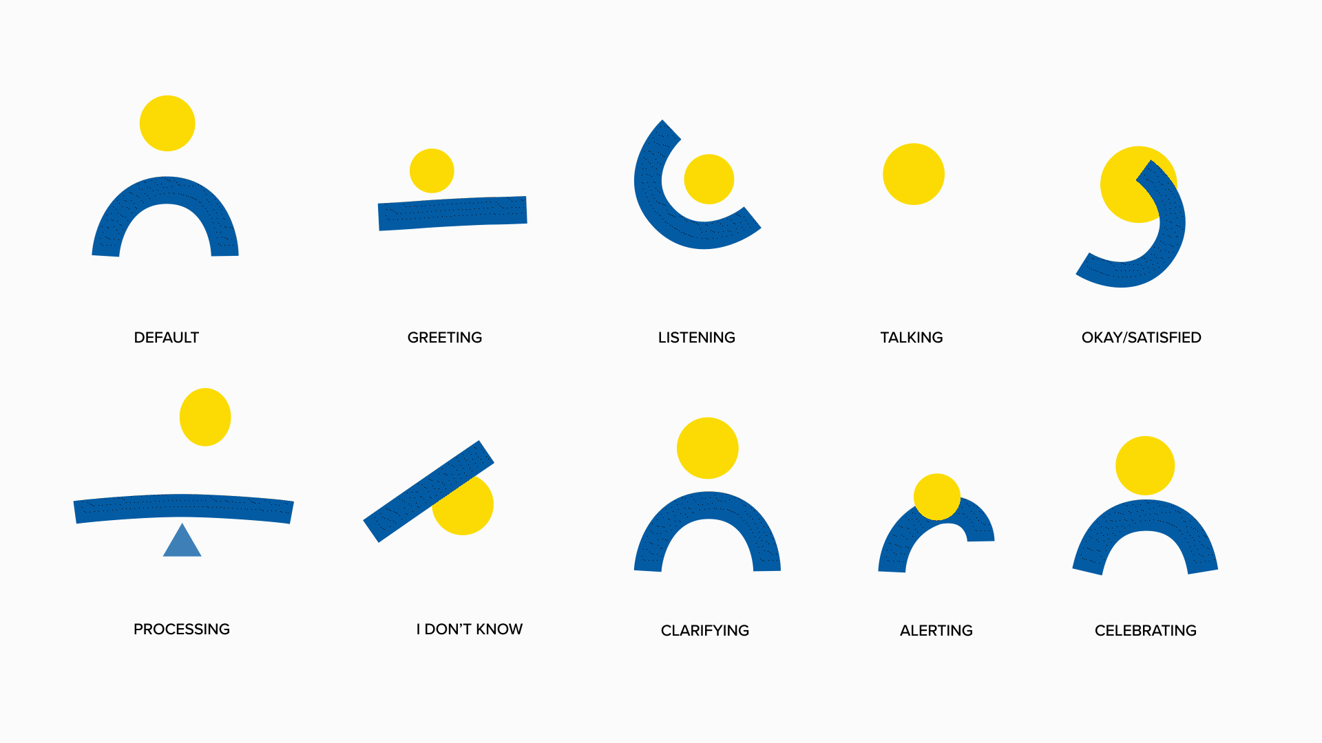
AGU fits the IKEA brand, universal, and could be applied globally considering the our CUI will grow and evolve over time. We used simple circle and a stroke with the iconic IKEA yellow and blue. Our focus was on making sure AGU has a clear contrast between different states considering users’ mood/feelings and cognitive overload while assembling furniture parts.
STATES OF AGU
BEFORE AGU: CUI ITERATIONS
Some of our early iterations were series of exercises focusing on exploring variety of different shapes, strokes, sizes, and colors to foresee all of the possibilities of our IKEA CUI. Along with the visuals, we started brainstorming key movements of the CUI.


For our third iteration, we used iconic furniture products of IKEA such as lamp and different color combination with the IKEA yellow and blue. From the feedback we gained from the last iteration, accessibility was one issue we wanted to focus on; we tried to move away from using too much white in our CUI since the majority of IKEA app screen uses white.
For this iteration, we explored using a combination of simple geometric shapes and strokes with the iconic IKEA color yellow and blue mimicking the concept of assembling furniture parts.


CONVENIENT
TIME EFFICIENT
SMART
Agu saves you the trouble of sifting through customer service pages, waiting for a staff member on the phone, or another trip to IKEA.
Agu draws its knowledge from a growing database of existing information and user input. For example, knowing how many types of screws a furniture needs by just knowing its name.
Agu schedules your delivery based on existing orders Ikea customers’ destination, saving both time and money.


USER PERSONAS + USER JOURNEY
Here are two examples of potential users who might come in contact with this IKEA CUI and their user journey.


Beyond the Ikea blue and yellow that we used to design the CUI, my team wanted to make the video approachable and friendly. We used a variety of colors that helped compliment the primary colors and chose a simple san-serif font to go along with the simplicity of our CUI.
VISUAL SYSTEM

We took major inspiration from the Ikea manual books. The instruction books that come with every Ikea furniture is filled with illustrations that are simply lined yet still sparks personality.
VIDEO ILLUSTRATIONS